Growth Hacking in Trigger-Based Emails of Quelle Online Store: up to 45,1% conversion growth!

Growth hacking experts at Retail Rocket run dozens of A/B tests every day, checking the hypotheses of email newsletter designs with the aim of increasing the revenue of web shops. Today, we will use the example of the Quelle online store to tell you about the progress that can be achieved by correctly choosing the email subject and the sending time, by optimizing the size of product images and by deleting certain elements that could distract the customer’s attention.
Why do we run such a large number of tests? To understand how the same changes to the email templates have a different impact on the indicators depending on the scenario in which they are applied. For example, in today’s collection of email marketing Growth Hacks we are testing the same hypothesis in three different scenarios. And—unsurprisingly—we get different results.
The experiments are conducted by using the A/B testing mechanism, randomly splitting all email recipients into two segments in real time. Segment A receives the current email version, while Segment B receives emails with an alternative containing a hypothesis.
Optimizing Emails with “Abandoned Browse” of Items
When a customer browsed the website but did not add anything to the cart or the wish list, i.e. did not perform any useful actions, it is a good time to send them a personalized email with the items they browsed and with product recommendations of the items that they might like. This helps not only to remind the customer about what they were interested in but also to show the items that they did not manage to see.
Case Study 1. Influence of the Email Subject on the Open Rate. Using the “Urgency” Trigger
Hypothesis:
Changing the subject line of the email and adding the urgency message will increase the customer’s interest in the purchase and, consequently, in opening the email.
Segment A (no change): “You have found what you were looking for!”
Segment B (alternative subject): “The items you are interested in may end soon”
Result
The A/B test showed the following results:
| Open Rate (%) | |
| Group A | 38.1 |
| Group B | 39.6 |
| Δ | +3.9% |
The use of an alternative subject in the template for the “abandoned browse” scenario led to a 3.9% increase in the Open Rate. The statistical reliability of the test results was 99%.
Case Study 2. The Optimal Time for Sending Emails
Hypothesis:
Reducing the delay before the email is sent from 1 hour to 30 minutes after a user left the website without a purchase will reignite the fading motivation to make an order and, consequently, to perform any potential actions related to the email.
Original delay before sending an email (Segment A): 1 hour
Alternative delay before sending an email (Segment B): 30 minutes
Result
The A/B test showed the following results:
| Open Rate (%) | |
| Group A | 39.5 |
| Group B | 41.5 |
| Δ | +5.1% |
Reducing the delay with emailing in the “abandoned browse” scenario from 1 hour to 30 minutes led to a 5.1% increase in the Open Rate. The statistical reliability of the test results was 99%.
Case Study 3. Changing the Size of product images and Introducing the “Purchased Today” Element
Hypothesis:
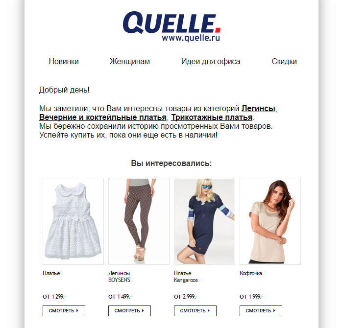
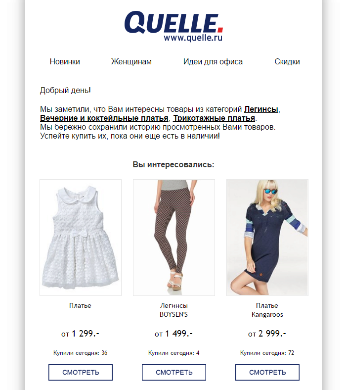
Increasing the size of the product images and adding the “purchased today” element boosts the interest in these items due to other peoples’ interest in these items (social proof).
 |
 |
| Segment A (no change) | Segment B (alternative design of product image) |
Result
The A/B test showed the following results:
| Click-to-Open Rate (%) | Click-Through Rate (%) | |
| Group A | 46.4 | 27.3 |
| Group B | 56.1 | 30.1 |
| Δ | +20.9% | +10.3% |
The increase in the size of the product images in the “abandoned browse” scenario and the addition of the “purchased today” element ensured the increase of 20.9% in the Click-to-Open Rate and of 10.3% in the Click-Through Rate. The statistical reliability of the test results was 99% and 98.3% respectively.
Optimizing Emails with “Abandoned Category Browse”
Customers can leave not just the product details page but also product category page. Different rules apply in this case and the solutions that work for “abandoned product page” scenarios may show very different results for the “abandoned category page” audience. As always, we can find out the truth with the help of a test.
Case Study 4. Changing the Size of product images and Introducing the “Purchased Today” Element
We decided to check whether the hypothesis from the previous case would work for the customers who did not open specific items and just browsed the category.
Hypothesis:
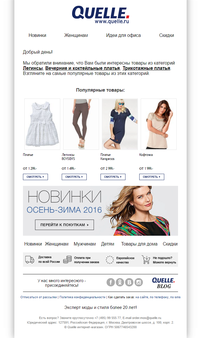
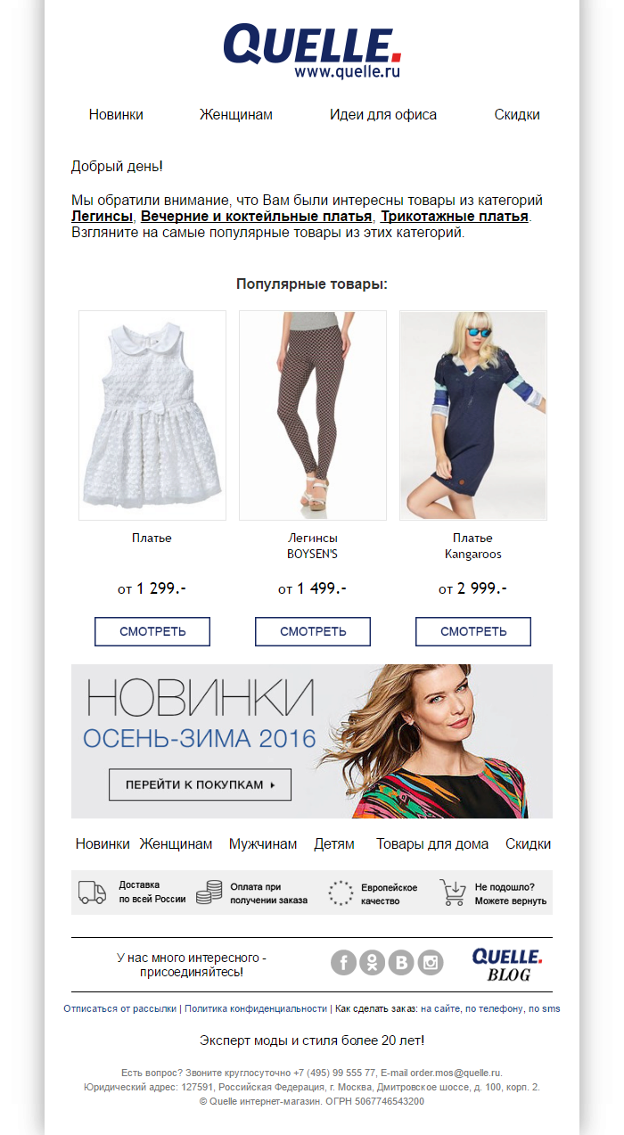
Increasing the size of the product images and adding the “purchased today” element boosts the interest in these items due to other peoples’ interest in these items.
The first test did not give positive results, so it was decided to delete the “purchased today” element, i.e. test only the increased product image size in the email.
The test was successful in this format, so we can conclude that the “purchased today” element works exclusively to reinforce the motivation to buy items already browsed or added to the basket and not to generate any initial interest.
 |
 |
| Segment A (no change) | Segment B (alternative design of product image) |
Result
The A/B test showed the following results:
| Conversion Rate (%) | |
| Group A | 3.17 |
| Group B | 4.6 |
| Δ | +45.1% |
According to the test results, the increase in the size of the product images in emails in the “abandoned browse” scenario of an item category ensured a 45.1% increase of the Conversion Rate indicator. The statistical reliability of the test results was 97.2%.
Optimizing Emails with “Abandoned Cart Recovery”
Abandoned carts are a source of perpetual concern for online stores. According to research, 70–75% of all shoppers abandon their cart, meaning that the store loses two-thirds of its potential buyers. Unfortunately, buyers will continue to leave the store without making a purchase. However, the good news is that the percentage of “abandoned carts” can be significantly reduced with the help of emails that remind potential buyers of forgotten items and recommend alternatives.
Case Study 5. Deleting Unnecessary Elements
Hypothesis:
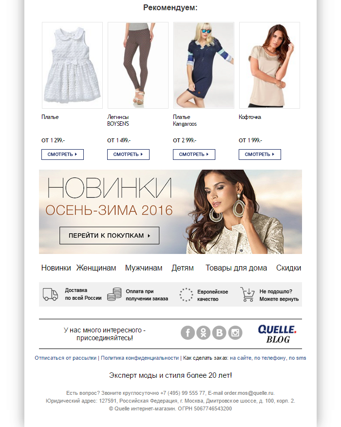
Removing the new arrivals banner will allow the user not to be distracted from the originally chosen purchase in which they already had an increased interest, and even an expected decrease in CTR will not outweigh the increase in CR.
 |
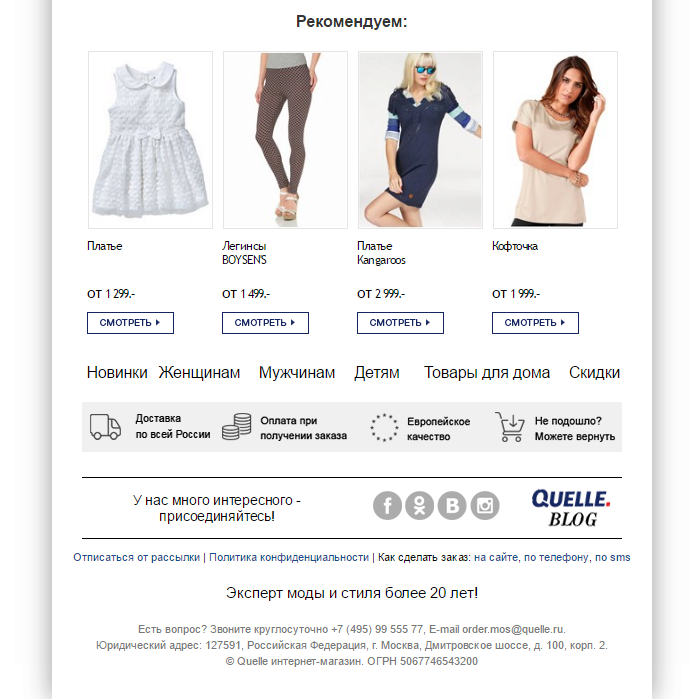 |
| Segment A (no change) | Segment B (alternative design of footer) |
Result
The A/B test showed the following results:
| Conversion Rate (%) | |
| Group A | 12.8 |
| Group B | 15.4 |
| Δ | +20.3% |
According to the test results, an alternative footer without the new arrivals banner increases the Conversion Rate by 20.3%. The statistical reliability of the test results was 96.1%.
Case Study 6. Changing the Layout of product images in the cart
Hypothesis:
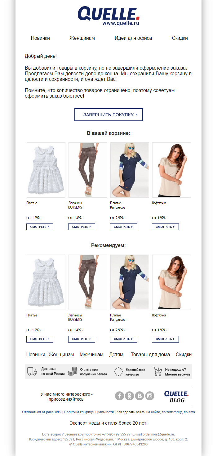
Changing the layout of product images in the basket from the classical vertical one to a horizontal one will reduce the desire to move to the cards of items already browsed and placed in the cart. This will lead to an increase in the number of clicks on the CTA transition to basket and on items that have not been previously selected in recommendations.
 |
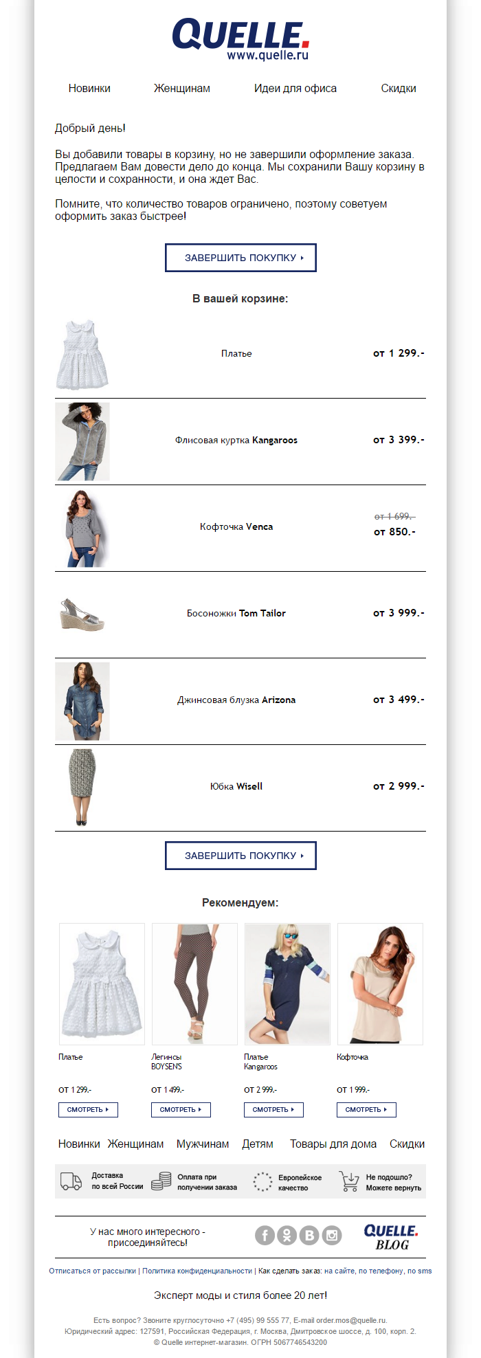 |
| Segment A (no change) | Segment B (with an alternative layout of product images in the order content) |
Result
The A/B test showed the following results:
| Conversion Rate (%) | |
| Group A | 10.2 |
| Group B | 13.5 |
| Δ | +32.4% |
According to the test results, an alternative basket layout increases the Conversion Rate by 32.4%. The statistical reliability of the test results was 97.5%.
Case Study 7. Changing the Size of product images and add the “Purchased Today” Element
Hypothesis:
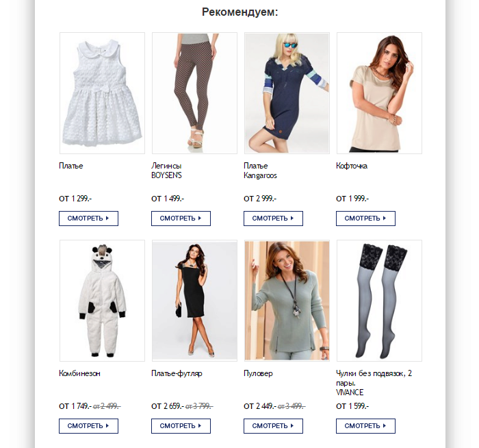
Increasing the size of the product image and adding the “purchased today” element boosts the interest in these items due to other peoples’ interest in these items, while even a reduction in the total number of recommendations should not affect the increase in clicks.
 |
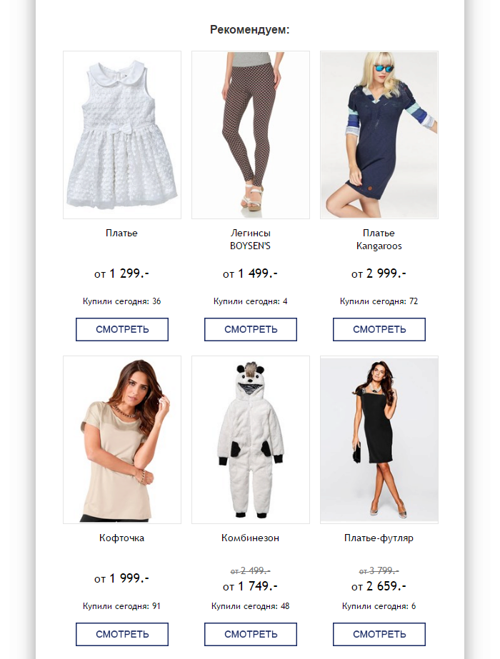 |
| Segment A (no change) | Segment B (alternative product image) |
Result
The A/B test showed the following results:
| Conversion Rate (%) | |
| Group A | 7.4 |
| Group B | 10.2 |
| Δ | +37.8% |
The test results showed that an alternative product image increases the Conversion Rate by 37.8%. The statistical reliability of the test results was 94%.
Summary
Automated trigger-based campaigns are a must for successful email marketing strategy. Retail Rocket Triggered Emails Platform is designed specifically for Ecommerce, based on website behaviour and the customer journey stage, each user gets their own personalized email: abandoned website browse remarketing, abandoned cart recovery emails, follow-up reminders and other trigger-based email scenarios. But just launching those automated email campaigns is not enough – key to success is constant iterative optimization of your marketing communications.
Comments from Quelle
 In theory, any online store can operate independently without using the services of external providers. This requires a lot of patience and significant internal resources for development and management.
However, there is a different way: Entrusting some important customer-communication processes to a partner with vast experience and a large team that is fully focused on the effectiveness of their service.
One of the key factors in our cooperation with Retail Rocket is the continuous process of improvement and finding new efficient solutions, even for regular processes. Ecommerce is becoming a more complex system where no detail is too small and all nuances are important and lead to market success when optimized.
Andrew Osokin, Marketing Director at Quelle


